I really dislike the new Macbook. It may be ’cause my daily driver for more than 5 years was a 2009 Macbook Pro. I loved the design: sturdy, with awesome keyboard and upgradable. It lasted without too many hiccups for all that time in a world where the upgrade cycle of many electronic products is no more than two years. After a brief switch to the Microsoft Surface I wanted my old laptop back, or even better; the closest thing I could buy. The Apple lineup just refreshed with the ‘new’ Macbook Pro 2016. I was so disappointed by what I saw where once you could buy beautiful design with convenient build and inputs. I ended up buying the 2015 model (in my opinion, the last great laptop Apple made). In this article I’m going to present what the dream revision from the new model could look like.

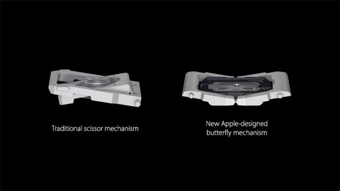
Admittedly many of the changes are going to be rollbacks, anyway, let’s begin now with: the key switches. One of the things I enjoy most on computers is writing. It may be a pet-peeve of mine, hearing the sounds of button mashing has something to it. Maybe it resonate with the idea of journalists typing news away, that what you write has weight and importance. To me the old Macbook Pro keyboards ticked all the possible boxes. It had nice height and a good layout. Even the cleaning wasn’t such a big deal. You either spray canned air or occasionaly pop some keys out. With the new model and the recent rush to thinness we got one of the slimmest keyboard ever. Ergonomically it’s far from ideal and the feeling is getting closer and closer to typing on a screen. I’ve to say that you get used to it after a while, like everything, but this time I think the tradeoff is a losing one. The main reason Apple changed the ‘traditional’ scissors mechanism to the butterfly one was to taunt better reliability. This was apparently not exactly right as you can read in multiple articles. The first thing I would do is going back to the old keyboard, increasing the key height and the arrows’ layout.
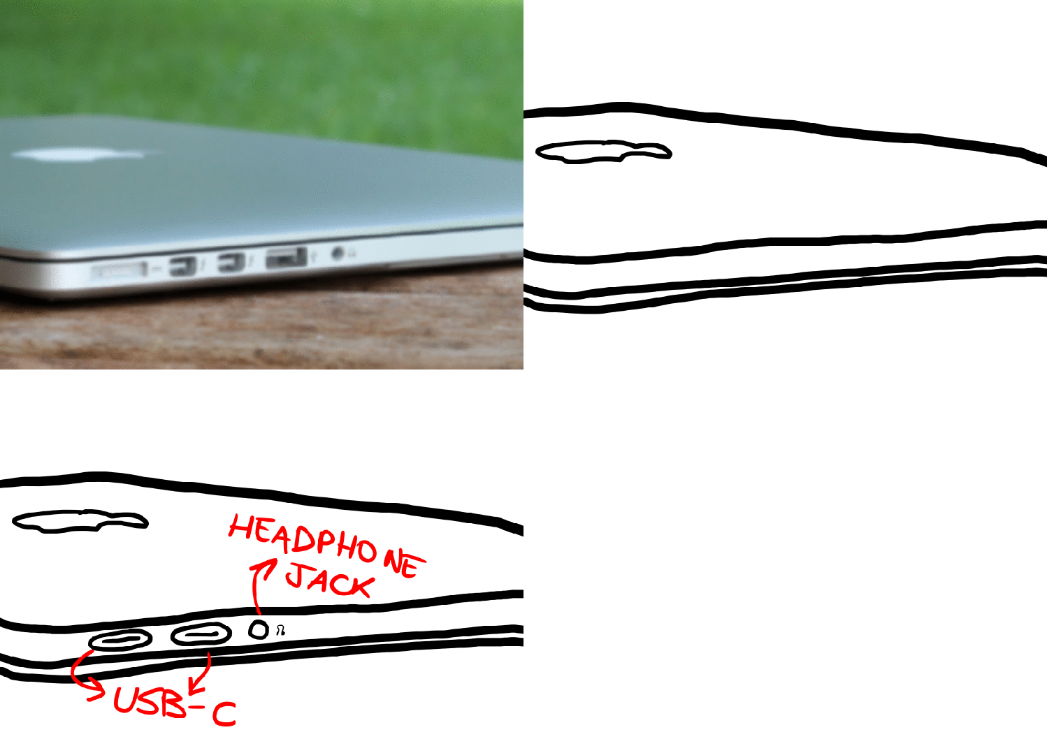
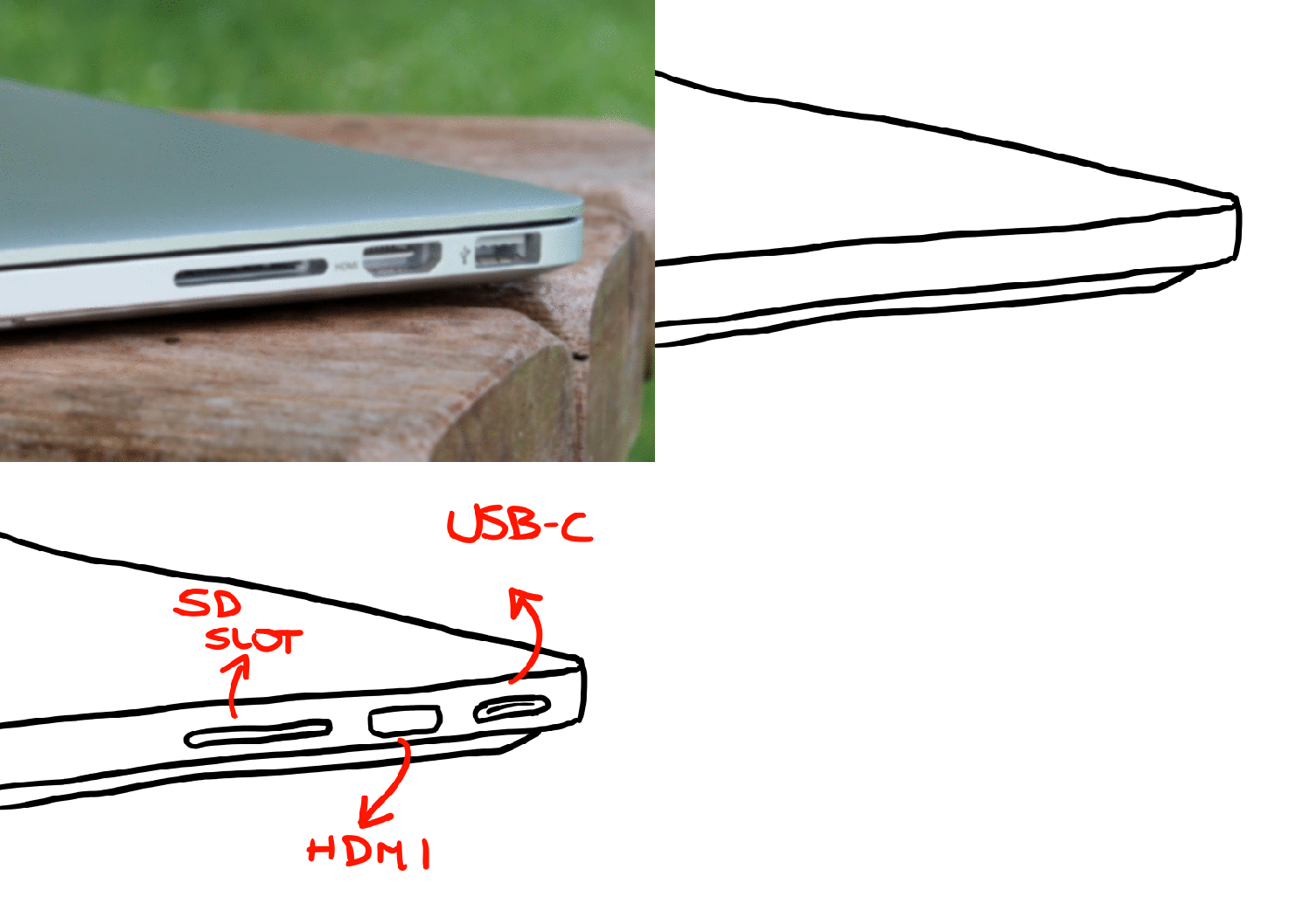
The second change would be the inputs. The ‘make it simple’ philosophy has come to damage the conveniency of the user. While it’s true that having only one port (USB-C) is potentially really convenient, we still live in the real forward. While dropping the CD in hindsight was a good move seeing the increasing broandband expansion. We too many ways of connecting devices to our computers. The HDMI port and the SD slot are still a must especially for a pro-fessional audience. Most of the buyers will end up buying a USB hub and/or adapters to connect their cameras or monitor (which I would say are pretty common use cases). The introduction here would be to aid the users while waiting for the ecosystem as a whole to catch on.
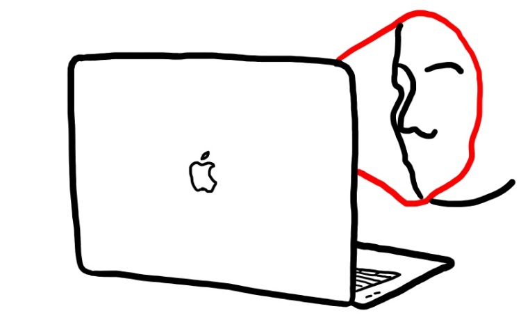
Last, but not least: Face ID. While on the phone it may have been a bad move. On the laptop it would be a perfect fit. It would quicken the logging process and increase security. There wouldn’t be issues about angles since the face is practically always in front of the screen, and best of all, the technology is already developed and it doesn’t really require much space for it.
To sum up the main addition I’d wish to see on the new Macbook Pro line are a better keyboard, more ports and Face ID. With these three things I could even pass over the non-existant expandability and it would make the Macbook a ‘buy’ again.
Thanks to the one of you who read the article! I’d love to hear from you, feel free to reach out here in the comment section or on Twitter.
P.S. Ah, dear Apple please kill the touchbar. Sincerely.