November 27, 2017
Twitter is slowly rolling out 280-characters tweet limit increase worldwide. It’s in my opinion the last of the numerous features that stray the blue giant away from its original (intended?) vision. For the few of you who may not know, Twitter is one of the main social networking sites of the Web 2.0 along with Facebook and Youtube. It was founded 11 years ago and it has been a staple in the social media landscape ever since.
When it was first launched Twitter was called twttr*,*** you could write to it via SMS after having registered yourself via mobile number.

It was one of the first microblogging platforms (an evolution of the status update feature of the old IM applications). Its use was clear: broadcast a short, important message to your friends.
Pretty quickly everybody got in the Twitter frenzy and it became omni-present especially in TV and live broadcast events. The usage varied widely, from news reporting, entertainment, public safety and art. It had a really simple premise to get: sending your bite-sized messages to the people who cared about them. One of the things that made it great was seeing the timeline in real-time, an unfiltered stream of the Internet’s collective consciousness.
Now both of the “features” that made Twitter are gone. The timeline is by default “curated” for new users, giving the tweets that the service thinks are most relevant to you. Furthermore, the messages are not small bits of informations, but large picture-including behemoth. Rendering the experience on mobile, especially, much more heavy.
Plenty has been written on why the mimicking of a Facebook-like experience (curated timeline) is bad for Twitter and I don’t want to put more wood into the fire. It was allegedly done to relieve some sort of inherent noise problem, but without appealing to the core competency of the product. The only thing I want to add to the discourse though is this. One of the thing that made Twitter great was it’s immediacy, knowing something happened on the other side of the world, unfiltered and before the news outlets could report it. What we’re losing here made the experience great and “exciting”, something you couldn’t really find anywhere else.
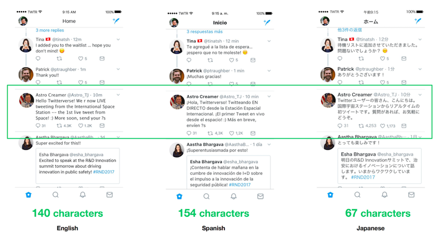
But let’s talk about the main culprit now: increasing tweets’ size limit. It has been reported that this move of increasing the size limit was done, among other things, to make equal ground between the western usage and the eastern one. Users of asian languages based on ideograms or syllabic writing systems like Japanese or Korean could squeeze a lot more than their English counterpart per each tweet.

This thinking doesn’t really take into consideration how this limit shaped the interaction with the product. While on Japanese Twitter you could find out what you may as well consider mini blog posts, on the US side of things you were bound to find quick witted responses and bare-boned ideas. This constraint shaped its usage, users were forced into refine their thoughts and use one-liners. This made flourish AP-styled news accounts and small gems like haiku and poetry profiles. The Unique Selling Proposition (USP) of Twitter’s 140 characters was exactly what made it great. And I’m not the only one who thinks that, as some of the most followed writers on the platform cared to express: JK Rowling and Stephen King. Now Twitter risks to be less quick and fun, turning itself into a sort of Tumblr competitor.

Another issue I’m really wary of is strictly on the UX perspective. Larger tweets takes more space than what the main app already lends them. This has a grave implication. More scrolling to reach more interesting content. In a day and age in which software developers strive to get the users’ attention this makes somewhat harder for the people to stay engaged. The problem was bad enough when the platform switched from being mainly text-centric to when it allowed the inline inclusion of images. The increased real estate size that each tweet takes is particularly bad in this new smartphone world. Instead of making the aforementioned noise problem better this may only worsen things, giving non relevant tweet to much of a display.
The race to monetize and catch new users seemed to have made Twitter forget what their core product was really all about. With this new feature it may be only a matter of time that this stale, innovation frenzy giant pushes even more user away of its platform.
Thanks to any of you who may have read thus far, if you have any comments or ideas I’d love to hear from you!
P.S. Related to this new feature I suggest this really interesting and well-written blog post from Josh Wilburne, a designer working at Twitter, from which one of the above picture was taken from.